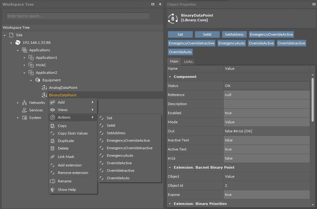
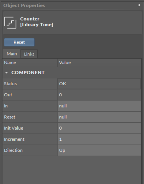
After selecting a component, the Object Properties window shows four sections:
-
section with a slot list (the Main tab);
-
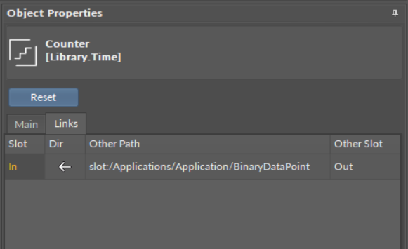
section with a list of outgoing or incoming links to the selected component (the Links tab);
-
section with a list of configuration data of the selected component (the Info tab)–only available in the Developer mode;
-
section with Action buttons (blue buttons above tabs).
In the upper bar of the window, it shows the name and type of element, which data is displayed.
-
Main tab: allows reading and editing of the selected component’s slots. If the user changes the value of a slot in the Object Properties window, new value is immediately saved in the controller. The Object Properties window works in the auto save mode.
Worth to Notice:
This section is also available to components in libraries (selected in the Device Libraries/Kits window), and allows to check the slots offered by a particular component even before using it in application. |
-
Links tab: informs about all incoming and outgoing links with a full location path of target components and the names of target slots. For each link, it is possible to choose the following options from the context menu:
-
Go to link: transfers to the Wire Sheet view of a superior of a target component;
-
Go to component: transfers to the Property Sheet view of a target component;
-
Delete link: removes a chosen link.
-
-
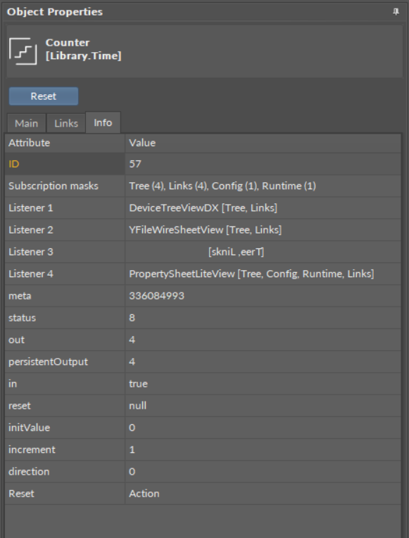
Info tab: (available only in the Developer Mode) shows the identification and configuration data of the selected component;
-
Actions section: buttons available in the bar above tabs, allowing a simple execution of actions on selected component. These are the same actions which are listed in the component’s context menu under the Actions option.