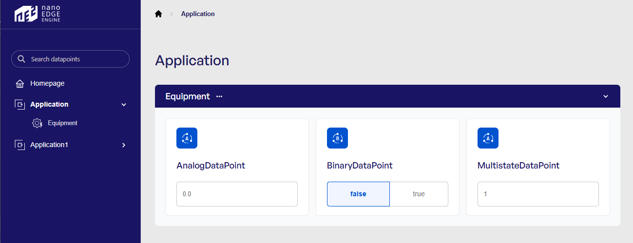
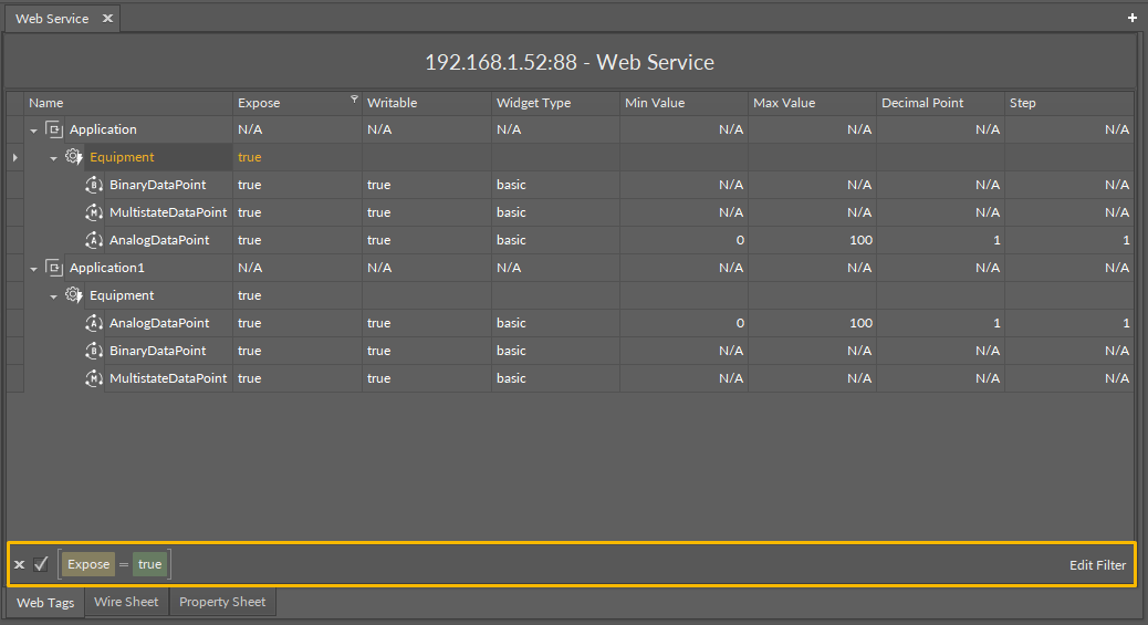
The Web Tags is a view containing the list of all Equipment components and Data Points presenting values of tags related to the nanoWebUI™ display of the point.
Note
The Application component is displayed in the Web tags view only for identification reasons as the component cannot be subject to auto-tagging or adding tags at all.
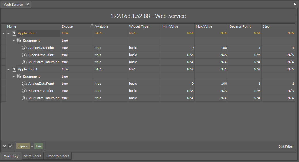
The Web tags view has the following columns:
-
Name: shows the name of the Application, Equipment component or Data Point added to the device; the Application/Equipment/Data Point hierarchy is maintained in this view;
-
Expose: informs if the
web:exposetag is active for the given Equipment component or Data Point; -
Writable: informs if the
hs:writabletag is active for the given Data Point; -
Widget Type: informs which widget type is set in the
web:widgetTypetag for the given Data Point; -
Min Value: informs what minimum value is set in the
hs:minValtag for the given Data Point; -
Max Value: informs what maximum value is set in the
hs:maxValtag for the given Data Point; -
Decimal Point: informs which decimal point is set in the
web:decimalPointtag for the given Data Point; -
Step: informs what step value is set in the
web:steptag for the given Data Point.
Actions
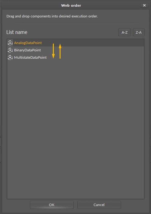
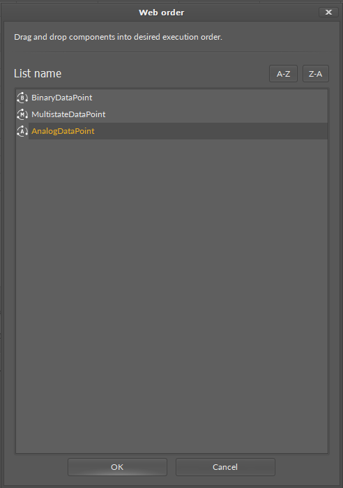
Web Order
For the nanoWebUI™ display clarity and accuracy of representation of the user’s requirements, in the Web tags view, it is possible to edit a web order of Data Points displayed in the nanoWebUI™. The order of components presented in the Web Tags view reflects the order of Data Points in the nanoWebUI™.
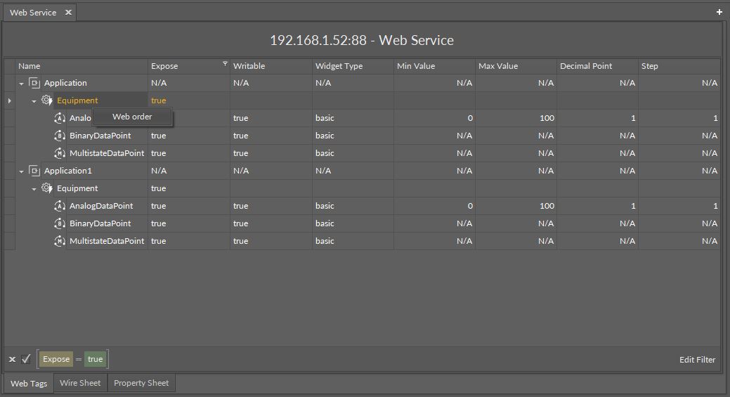
On the Application and Equipment components, it is possible to open a web order option from the context menu. It opens a dialog window, where it is possible to drag and drop components to change their order:
Filtering
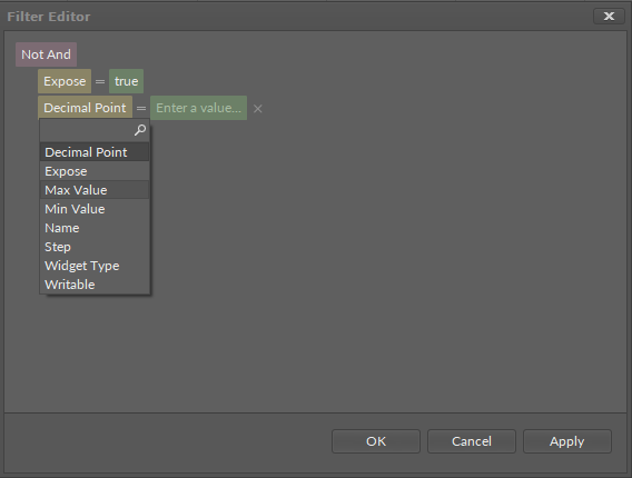
The Web tags view offers a filtering option for an adaptable display of Data Point’s list according to the user’s requirement. Filtering of the view can be performed based on the tags from the Webserver dictionary. By default, the list is filtered by the web:expose tag, showing only Data Points, which are exposed to display in the nanoWebUI™.
To edit filters, use the Edit Filter button, which opens a dialog window.
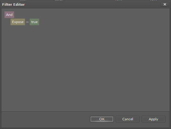
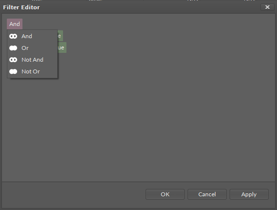
In the Filter Editor, the filters are presented in two levels: groups of logical indicators (violet button) and filtering conditions (yellow button).
Pressing the logical indicator button shows a drop-down list with available options (And, Or, Not And, Not Or):
For a logical indicator, it is possible to add an additional filtering condition and a subsequent logical indicator with more filtering conditions (available by pressing a plus symbol visible when hovering a mouse pointer over a logical indicator):
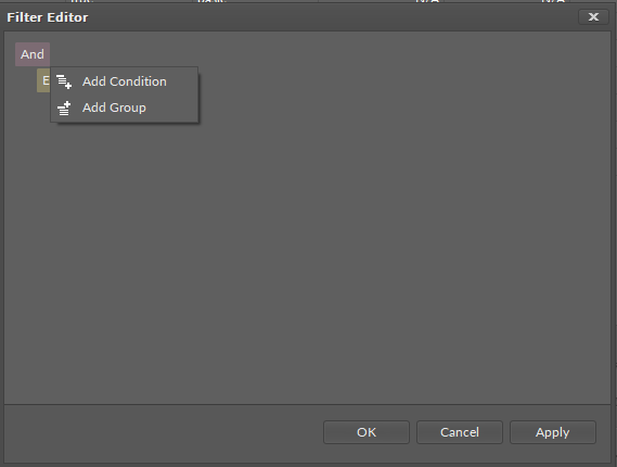
-
Add Condition: adds a new filtering condition on the level of the host logical indicator:
-
Add Group: adds a new logical indicator with a condition:
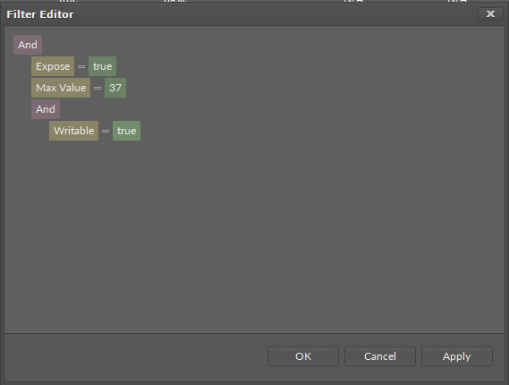
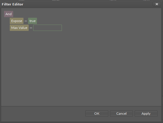
To apply filters without closing the Filter Editor, click the Apply button. To confirm all selected filters and close the Filter Editor, click OK.
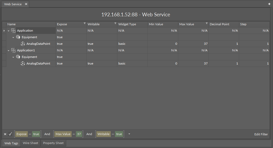
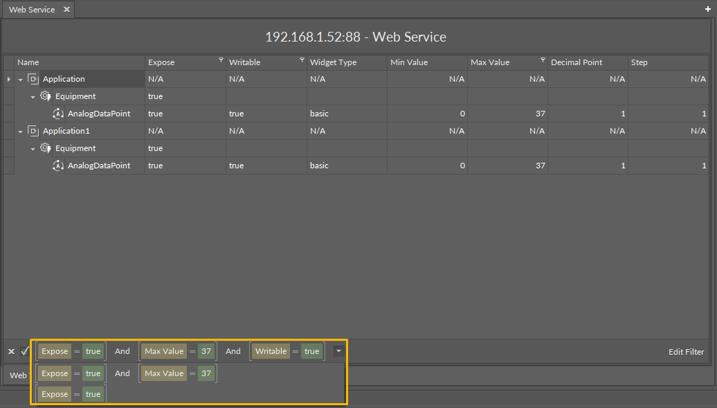
The list of pre-applied filters is available under a drop-down arrow on the right side of an applied filter:
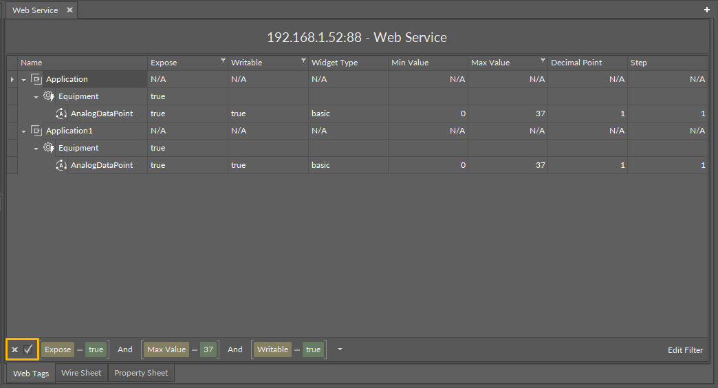
The applied filter can also by temporarily unchecked or permanently deleted with cross and check symbols on the left side of a currently applied filter:
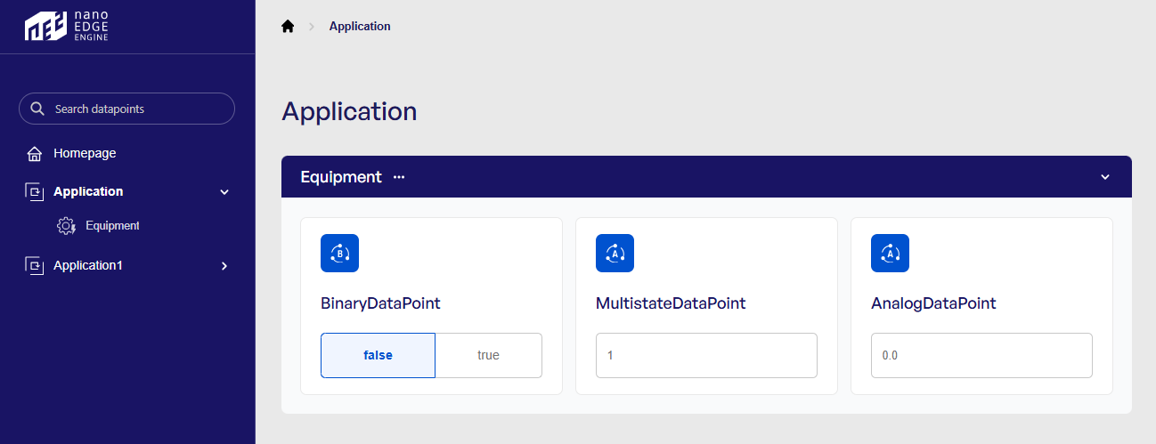
To find out more about the nanoWebUI™ web interface, please visit: nano EDGE ENGINE - nanoWebUI™.