The nanoWebUI™ is a modern HTML5 web user interface that presents live nano EDGE ENGINE-controller data from applications, Equipment components and Data Points. The view is automatically generated during controller programming.
The nanoWebUI™ is based on the Haystack HTTP API and creates a fully functional, responsive UI the moment a control logic is deployed. It provides a structured real-time visualization, enabling an effective time-saving monitoring and direct control of system data. The web interface is easily accessible from an HMI panel or a standard web browser on PC and mobile devices.
Initial Requirements
The nanoWebUI™ is easily accessible after entering the controller’s IP number and port to a web browser, for example: 198.162.1.123:88. It will be automatically generated and displayed for a correctly connected (ETH cable) and operating controller. However, a few initial requirements have to be met for a correct functioning of the nanoWebUI™ interface.
These initial requirements involve making sure that all required libraries, services, and tags are installed and enabled on the device.
Initial Requirements
-
Installed libraries:
-
Haystack,
-
Tagging,
-
Web,
-
Resource.Web;
-
-
Enabled services in the Services container:
-
Tagging service,
-
Web service,
-
Haystack service.
-
Display Requirements
-
Enabled auto-tags:
-
in the Equipment components (enabled by default),
-
in Data Points (required manual enabling);
-
-
web:exposetag is set to true in all Equipment components and Data Points, which are supposed to be displayed on the nanoWebUI™ (true by default); -
Data Points are enabled and licensed.
Structure
The nanoWebUI™ structure is derived from the Resource.Web file, which is a part of the nano EDGE ENGINE OS and is visible in the Software Manager.
The presented structure is based on the Resource.Web V1.9.0.254 and is delivered with the nano EDGE ENGINE OS V1.9. It is the default layout of the nanoWebUI™.
Homepage
The nanoWebUI™ window is divided into two parts: left panel and main window. The left panel displays a search box, homepage reference, and all applications saved on the controller. All elements in the left panel are displayed with a relevant icon and are clickable and expandable, allowing to select an element to display in the main window.
In the main window, the nanoWebUI™’s homepage for a controller, where the application is constructed with a proper application structure (more details: Equipment), initially displays bars with all applications saved on the controller:
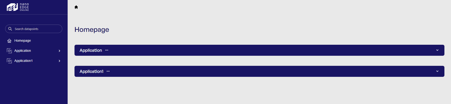
Tip
To expand an element, click on three dots on a bar or an arrowhead in the left panel.
Note
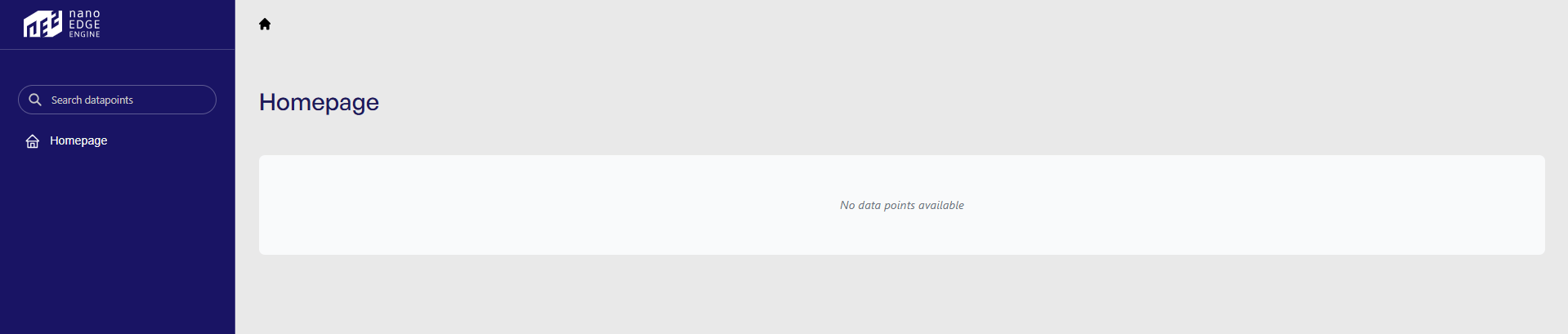
If there are no tagged Data Points in the application(s) or the web:expose tag is configured to false (in either the Data Points or the Equipment component), the nanoWebUI™ will show an empty homepage:
Application
Elements displayed in the nanoWebUI™
Elements displayed in the web server are strictly connected with tagging functionality.
Applying tags in the nano EDGE ENGINE is based on a semantic approach that ensures consistent data structure which is easily usable by the nanoWebUI™ and by third-party systems. Tags are applied at the Equipment and Data Point levels, where Equipment serves as the logical container defining what is being controlled, and Data Points represent the measured or commanded values associated with that equipment. This structured model ensures that tagged data is immediately usable by platforms capable of communicating through standardized tag-based HTTP APIs, e.g., Haystack.
Note: Tags can be only applied to the Equipment components and Data Points. Other component types are not supported.
It is therefore recommended (however, not mandatory) to use the following structure when creating applications:
-
Applications container
-
Application component
-
Equipment component
-
Data Point(s)
-
other components
-
-
Equipment component
-
Data Point(s)
-
other components
-
-
-
Note
The Application and Equipment components are displayed provided that at least one licensed Data Point with auto-tags enabled and the web:expose tag set to true is placed under either one of them.
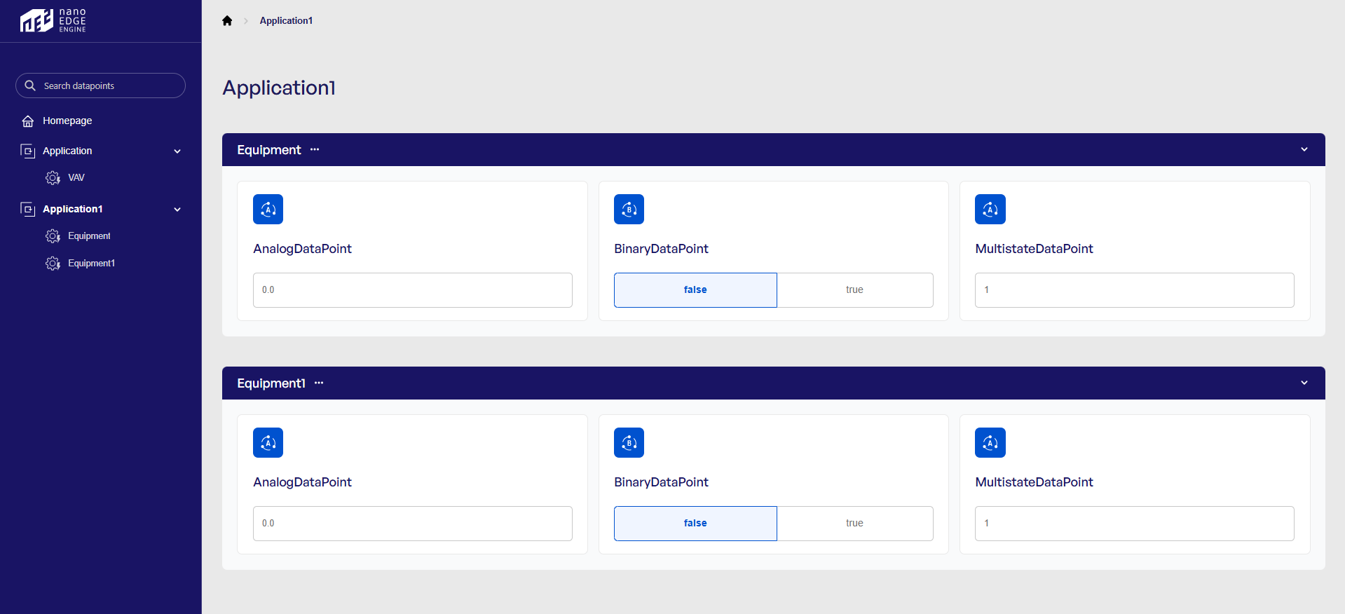
The left panel contains the list of applications saved on the controller and Equipment components.
The main view shows Data Points organized by Equipment in the application. Data Points are presented as widgets, which presents the current Data Point’s value and can be editable under certain conditions.
Web Order
For the nanoWebUI™ display clarity and accuracy of representation of the user’s requirements, it is possible to adjust the web order of Data Points display. The mechanism is dependent on the tool in use:
Changing Data Points web order:
-
in iC Tool: Web Tags view
-
in iC Workbench with nE2 Link module: Web Tags manager
Widgets
There are four types of widgets applied to display Data Points values.
Selecting Widget
A specific type of widget can be selected in the web:widgettype tag.
Note
Not every type of widget can be used for all types of Data Points, however, each can be selected. For example, the BinaryDataPoint can only use the basic widget, therefore, setting the step widget for the BinaryDataPoint will simply have no effect on the web server display.
In the further description, please note which type of widget is applicable to which Data Point.
Types of Widgets
Basic
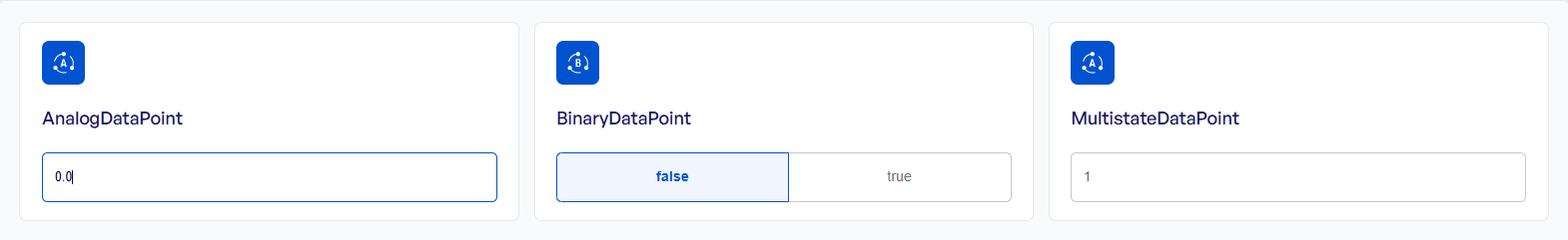
The basic widget can be applied to all types of Data Points.
It shows the Data Point’s current value and allows to edit it (send new value to the controller) if the Data Point is set to the Output or Value mode and the hs:writable tag is active.
Step
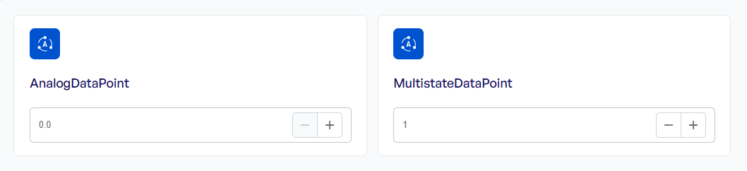
The step widget can be applied to the AnalogDataPoint and MultistateDataPoint.
It shows the Data Point’s current value and allows to edit it (send new value to the controller) by the value of a step.
The widget is editable if the Data Point is set to the Output or Value mode and the hs:writable tag is active.
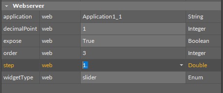
In the case of the AnalogDataPoint (does not apply to the MultistateDataPoint), it is possible to set the step value in the Tags tab in the Object Properties window, in the web:step tag:

Effectively, there are no minimum or maximum limitations as to the step value.
Slider
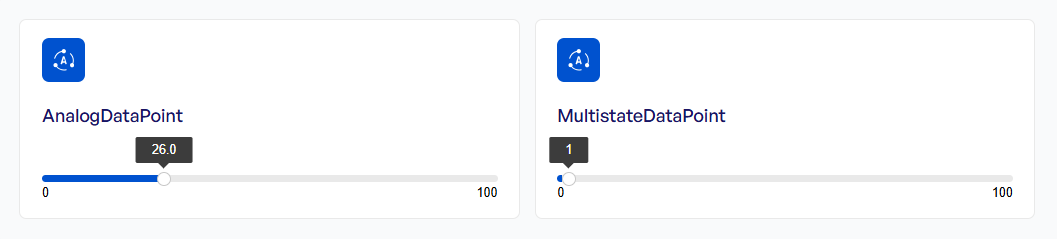
The slider widget can be applied to the AnalogDataPoint and MultistateDataPoint.
It shows the Data Point’s current value and allows to edit it (send new value to the controller) by setting a value on a slider.
The widget is editable if the Data Point is set to the Output or Value mode and the hs:writable tag is active.
In the case of the AnalogDataPoint (does not apply to the MultistateDataPoint), it is possible to set the step value in the Tags tab in the Object Properties window, in the web:step tag:
Effectively, there are no minimum or maximum limitations as to the step value.
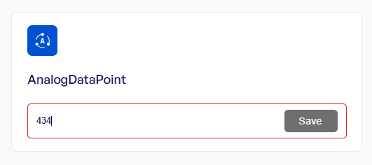
Fill
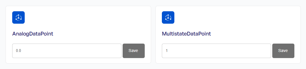
The fill widget can be applied to the AnalogDataPoint and MultistateDataPoint.
It shows the Data Point’s current value and allows to edit it (send new value to the controller) by typing a specific value and pressing the Save button.
The widget is editable if the Data Point is set to the Output or Value mode and the hs:writable tag is active.
Note
If a widget is editable, in the editing mode the widget’s frame is blue. If an entered value cannot be accepted by the Data Point (for example, it exceeds the hs:maxVal value), the frame will be marked red and the value will not be sent to the controller:
Unavailability Notification
If any of the initial requirements for the nanoWebUI™ functioning is not fulfilled (see the top of this section: any of the required libraries is not installed or any of the required services is disabled), the nanoWebUI™ will display the following notification:
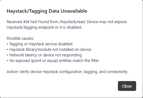
For a correct display of the web server, please make sure that all initial and display requirements are fulfilled.
Other Notifications
In case of any other malfunctioning of the nanoWebUI™, a proper notification pops up with a description of an issue and steps suggested to undertake.
|
Notification |
Message |
|---|---|
|
Language selector |
Select language |
|
Invalid Haystack response |
Haystack operation returned invalid status. Steps:
|
|
Could not parse Haystack response |
Could not parse response for Haystack operation. Steps:
|
|
No elements to display |
Haystack read operation returned no elements to display. Steps:
|
|
Haystack timeout |
Haystack operation timed out after ''. Steps:
|
|
Empty Haystack Response |
Haystack operation returned empty response. Steps:
|
|
Invalid pointWrite Response |
Haystack pointWrite operation returned invalid response. |
|
Can't fetch device information |
Haystack about operation returned empty zinc grid. |
|
Haystack subscription failed |
Haystack watchSub operation returned invalid response. |
|
Invalid WatchId |
Device likely lost connection for an extended period of time. |