The article describes how to correctly configure the visibility control of tabs (Label in LabelPane) in the TabbedPane widget on a station running on Niagara 4.7.109.20. In this version, the standard method (a component plugged into the ord slot in the Value Binding extension, followed by the animation of the visible property) from the WorkPlace program (or the NiagaraWebLauncher browser) works correctly, while in one of the popular web browsers or on the HDMI HMI panel (in one of the Hx profiles, i.e. HTML5 technology) the PX view does not load at all .
This is most likely due to the fact that the Hx profile first loads the TabbedPane as an object with a specific number of tabs (LabelPane), and later the value of the component is read (e.g., BooleanWritable), which can cause problems in this case.
The integrator may need this functionality, for example, to control the visibility of individual tabs for users with different levels of access to specific components.
Therefore, to use in the application:
-
Wb and Hx profile level views,
-
TabbedPane widget,
-
tab hiding control (LabelPane),
the following elements should be used to build views:
-
two separate PX files,
-
Px Properties view variables,
-
PxInclude widget to open one PX file (with TabbedPane widget) in the other.
Here are step-by-step instructions on how to build such a view:
-
Create two PX files, in the described example one of them will be called TabbedPaneContainer.px (it will include the TabbedPane widget and the entire visualization), while the second will be MainPX.px (will only include the contents of the first file using the PxInclude widget).
-
In the TabbedPaneContainer.px file, remove the default containers.
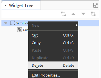
Fig. 1 Removing the default ScrollPane and CanvasPane containers in the PX view
-
Then, drag the CanvasPane widget from the bajaui palette in the Root position (in the Widget Tree window), the TabbedPane widget under the CanvasPane, and create three LabelPanes (drag the CanvasPane widget three times to the TabbedPane). Finally, change the names in the Label widgets - as a result, the following configuration should be achieved in the Widget Tree window:
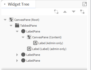
Fig. 2 Target widget configuration in the TabbedPaneContainer.px file
-
The next step is to add the properties of the PX file (in the Px Properties window) - after clicking the plus button, a pop-up window will appear to enter the name of the view property and select options as below:
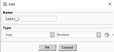
Fig. 3 Configuration of the view property
-
After adding two such properties, the Px Properties window should look as follows:
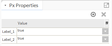
Fig. 4. Target configuration of view properties in TabbedPaneContainer.px file
-
Then the added properties should be linked via the Link option to the visible slot of the corresponding tabs (LabelPane); below is an example of doing this for the first tab:
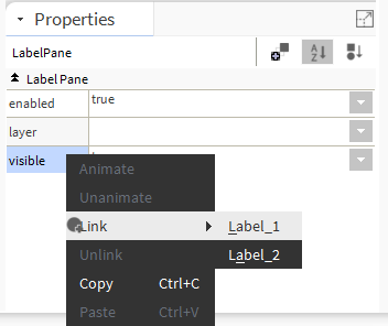
Fig. 5 Creating a Link between the view property Label_1 and the visible slot of the tabbed (LabelPane) TabbedPane widget
-
After creating both Link connections for the first two tabs, save the TabbedPaneContainer.px file, and then proceed to edit the MainPx.px file, where the PxInclude widget from the bajaui palette should be dropped into the workspace.
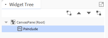
Fig. 6 Target widget configuration in the MainPx.px file
-
Next, in the PxInclude widget, indicate the TabbedPaneContainer.px file in the ord slot, then adjust the size of PxInclude to the window and save the changes.
-
After refreshing the MainPx.px view, new slots will be added in the PxInclude widget (in the Properties window), which are representations of the view properties previously created in the TabbedPaneContainer.px file. Here, add the Value Binding extension twice using the Add Binding button. Then, in the ord slots of the extensions, indicate the paths to two different BooleanWritable components.
-
In the next step, set separate animations (from separate Value Binding extensions) for both new slots (Label_1 and Label_2) of the PxInclude widget, while remembering not to use the default ‘I Boolean To Simple’ conversion but ‘I Boolean To Boolean’, as below:
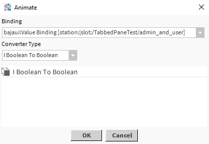
Fig. 7 Configuring the animation slot in the PxInclude widget in the MainPx.px file
Having completed the above operations, the following content should appear in the PxInclude widget in the Properties window:
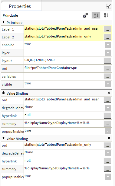
Fig. 8 Target configuration of the PxInclude widget in the MainPx.px file
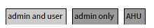
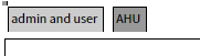
By creating the configurations described in the above sections, it will be possible to control hiding of bookmarks (LabelPane) in the TabbedPane widget in Niagara 4.7.109.20. The file, which should be a linked in the view set up on the selected folder in the example, is MainPX.px. Now, using the BooleanWritable components (admin_and_user and admin_only), it is possible to control the display of bookmarks (LabelPane) in two ways:
-
changing the value of the component,
-
changing the permissions of the component - assigning permissions is described in Niagara - Category, Hierarchy, Role, User - User permissions configuration.
In such a station, from both the Wb and Hx profiles, it is possible to control the display of individual tabs (LabelPane) on the PX view. It is, however, required to remember that after changing the configuration (permissions or values) of the BooleanWritable components, it is necessary to refresh the view to see the changes.
Fig. 9 Contents of the PX view before and after changing the configuration of the BooleanWritable component
The following station was made according to the above instructions and includes the sample configuration described in this article:
TabbedPane_label_visible_ctrl.zip
login: admin
password: Admin12345
passphrase: GlobalControl5