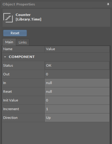
After selecting a component, the Object Properties window shows four sections:
-
section with a slot list (the Main tab);
-
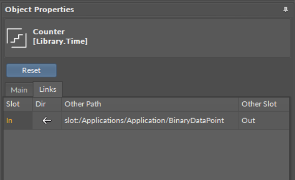
section with a list of outgoing or incoming links to the selected component (the Links tab);
-
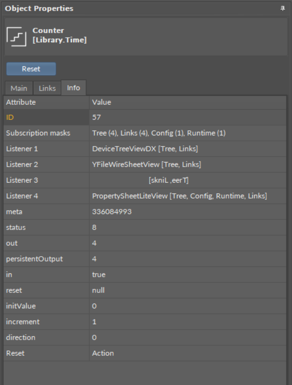
section with a list of configuration data of the selected component (the Info tab)–only available in the Developer mode;
-
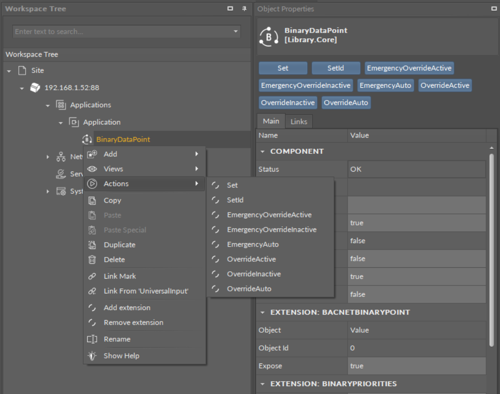
section with Action buttons (blue buttons above tabs).

The component's view in the Object Properties window
In the upper bar of the window, it shows the name and type of element, which data is displayed.
-
Main tab: allows reading and editing of the selected component’s slots. If the user changes the value of a slot in the Object Properties window, new value is immediately saved in the controller. The Object Properties window works in the auto save mode.
Worth to Notice:
This section is also available to components in libraries (selected in the Device Libraries window), and allows to check the slots offered by a particular component even before using it in application.
-
Links tab: informs about all incoming and outgoing links with a full location path of target components and the names of target slots. For each link, it is possible to choose the following options from the context menu:Go to link: transfers to the Wire Sheet view of a superior of a target component;Go to component: transfers to the Property Sheet view of a target component;Delete link: removes a chosen link.

The Links tab view in the Object Properties window
-
Info tab: (available only in the Developer Mode) shows the identification and configuration data of the selected component;

The Info tab view in the Object Properties window
-
Actions Section: buttons available in the bar above tabs, allowing a simple execution of actions on selected component. These are the same actions which are listed in the component’s context menu under the Actions option.

The Actions section in the Object Properties window
