The iSMA-B-LIB-GRAPH graphic templates can be expanded by additional components, which are contained in specific folders. Folders with equipment components are described in this section.
Please follow a few practical tips while working with graphic templates and additional components:
-
most graphic objects have light shadows, therefore, the palette looks best with black backgrounds;
-
the PX file, which graphic components are placed on, must have the Scale property set to the Ratio Fit for resolution different than default (for full-screen mode); for default resolution, the Scale property can be set as Ratio Fit or None.
The whole pallet is divided into folders structure, which is described according to the nomenclature and order are given in the following subsections.
Ducts
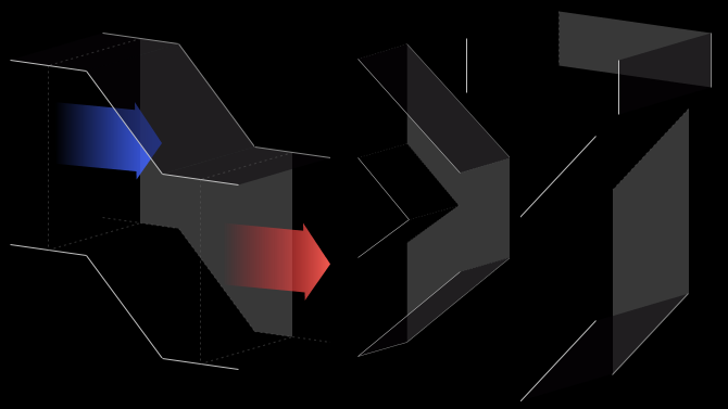
Sample graphic components from the Airflow folder
The Airflow folder contains static images representing ventilation ducts. Due to the features described above, graphic components in the folder with prefixes "duct_air", "duct_h", and "duct_v" must be distributed in the appropriate order in the PX file. Ventilation ducts on the right-hand side must be positioned higher (in display order - on a higher layer) than the ducts on the left-hand side.
The picture below shows the effects of incorrect (connection between duct 2 and duct 3) and correct (connection between duct 3 and duct 1) placement of objects in the PX file, where component numbers correspond to their order in the Widget Tree.
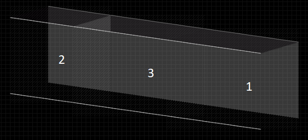
Effects of Airflow folder components placement
For ducts "duct_v", at the bottom of the PX file there should be an object that is first in order in the Widget Tree.
Dampers
Sample graphic components from the Dampers folder
The Dampers folder contains dynamic images representing air dampers. Due to the features described in section 3, graphic components from the folder with the prefixes "damper_round" and "damper_square" must be placed in the appropriate order in the PX file. This principle is the same as for the static images described in section 3.
Alarm Components
Components with the "alarm" suffix are dedicated to bind Boolean variables signaling an alarm or failure. Graphics representing the alarm status of the device have been added to these objects. The component has one control value (Value Binding), which affects the Visibility property. The true value in the Boolean type component causes the graphics to be shown, while false causes the graphics to be hidden.
On/Off Components
Components with the "off-on" suffix are dedicated to binding Boolean variables signaling operation or switching on. Graphics representing the status of switch-off and switch-on of a given device have been added to these objects. The component has two control values (Value Binding). The first one affects switching between switching off graphics (false for horizontal, true for vertical) and operation (true for horizontal, false for vertical) of the device. The second value affects the Visibility property, where false causes the graphics to be shown, while true causes the graphics to be hidden (same variable as for the alarm component above).
Dragging a Boolean component from the Nav tree to a PX file, selecting "From Palette" in the Make Widget window, and then selecting "From Palette" from the palette of the object with the "off-on" suffix automatically pinpoints the dragged component to the control value described as switching between switch-off and switch-on graphics.
0-100% Components
Components with the "0-100" suffix are dedicated to binding numeric type variables containing analog control value in the range of 0-100%. Graphics have been added to these objects to represent the percentage of opening or closing a device. The component has two control values (Value Binding). The first one affects switching between the graphics responsible for the level of opening (or closing) depending on the entered value from 0 to 100. The second value affects the Visibility property, where false causes the graphics to be shown, while true causes the graphics to be hidden (same variable as for the alarm component above).
Dragging a numeric component from the Nav tree to a PX file, selecting "From Palette" in the Make Widget window, and then selecting "From Palette" from the palette of the object with the "0-100" suffix automatically binds the dragged component to the control value described as switching between the graphics responsible for the opening (or closing) level.
For horizontal graphic components, the 0 value represents a closing and 100 an opening, while for vertical components, the 0 value represents an opening and 100 a closing.
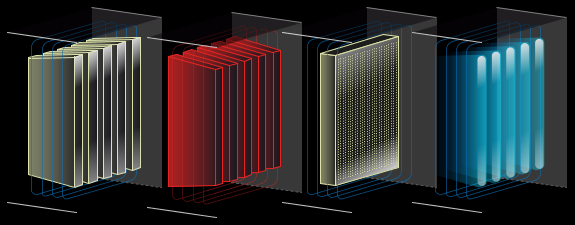
Cooling
Sample graphic components from the Cooling folder
The Cooling folder contains dynamic images representing air coolers. Due to the features described in section 3, the graphic components in the folder must be arranged in the correct order in the PX file. This principle is the same as for the static images described in section 3.
Alarm Components
Components with the "alarm" suffix are dedicated to bind Boolean variables signaling an alarm or failure. Graphics representing the alarm status of the device have been added to these objects. The component has one control value (Value Binding), which impacts the Visibility property. The true value in the Boolean type component causes the graphics to be shown, while false causes the graphics to be hidden.
On/Off Components
Components with the "off-on" suffix are dedicated to binding Boolean variables signaling operation or switching on. Graphics representing the status of switch-off and switch-on of a given device have been added to these objects. The component has two control values (Value Binding). The first one affects switching between switching off graphics (false value) and operation (true value) of the device. The second value impacts the Visibility property, where false causes the graphics to be shown, while true causes the graphics to be hidden (same variable as for the alarm component above).
Dragging a Boolean component from the Nav tree to a PX file, selecting "From Palette" in the Make Widget window, and then selecting "From Palette" from the palette of the object with the "off-on" suffix automatically pinpoints the dragged component to the control value described as switching between switch-off and switch-on graphics.
0-100% Components
Components with the "0-100" suffix are dedicated to binding numeric type variables containing analog control value in the range of 0-100%. Graphics have been added to these objects to represent the percentage adjustment of the device. The component has two control values (Value Binding). The first one affects switching between the graphics responsible for the level of adjustment depending on the entered value from 0 to 100. The second value impacts the Visibility property, where false causes the graphics to be shown, while true causes the graphics to be hidden (same variable as for the alarm component above).
Dragging a numeric component from the Nav tree to a PX file, selecting "From Palette" in the Make Widget window, and then selecting "From Palette" from the palette of the object with the "0-100" suffix automatically binds the dragged component to the control value described as switching between the graphics responsible for the adjustment level.
Heating
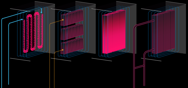
Sample graphic components from the Heating folder
The Heating folder contains dynamic images representing air heaters. Due to the features described in section 3, the graphic components in the folder must be arranged in the correct order in the PX file. This principle is the same as for the static images described in section 3.
Alarm Components
Components with the "alarm" suffix are dedicated to bind Boolean variables signaling an alarm or failure. Graphics representing the alarm status of the device have been added to these objects. The component has one control value (Value Binding), which impacts the Visibility property. The true value in the Boolean type component causes the graphics to be shown, while false causes the graphics to be hidden.
On/Off Components
Components with the "off-on" suffix are dedicated to binding Boolean variables signaling operation or switching on. Graphics representing the status of switch-off and switch-on of a given device have been added to these objects. The component has two control values (Value Binding). The first one affects switching between switching off graphics (false) and operation (true) of the device. The second value impacts the Visibility property, where false causes the graphics to be shown, while true causes the graphics to be hidden (same variable as for the alarm component above).
Dragging a Boolean component from the Nav tree to a PX file, selecting "From Palette" in the Make Widget window, and then selecting "From Palette" from the palette of the object with the "off-on" suffix automatically pinpoints the dragged component to the control value described as switching between switch-off and switch-on graphics.
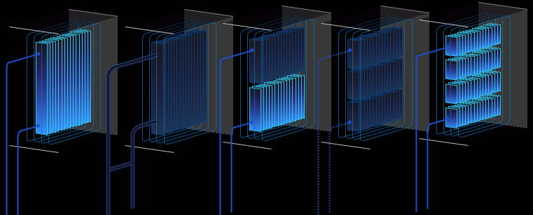
Filters
Sample graphic components from the Filters folder
The Filters folder contains dynamic images representing air filters. Due to the features described in section 3, the graphic components in the folder must be arranged in the correct order in the PX file. This principle is the same as for the static images described in section 3.
Normal/Alarm Components
Components with the "normal-alarm" suffix are dedicated to bind Boolean variables indicating normal state or alarm/failure. Graphics representing normal and alarm statuses of the device have been added to these objects. The component has one control value (Value Binding), which causes switching between the graphics of the normal state (false) and the alarm (true) device.
Alarm Components
Components with the "alarm" suffix are dedicated to bind Boolean variables signaling an alarm or failure. Graphics representing the alarm status of the device have been added to these objects. The component has one control value (Value Binding), which impacts the Visibility property. The true value in the Boolean type component causes the graphics to be shown, while false causes the graphics to be hidden.
On/Off Components
Components with the "off-on" suffix are dedicated to binding Boolean variables signaling operation or switching on. Graphics representing the status of switch-off and switch-on of a given device have been added to these objects. The component has two control values (Value Binding). The first one affects switching between switching off graphics (false) and operation (true) of the device. The second value impacts the Visibility property, where false causes the graphics to be shown, while true causes the graphics to be hidden (same variable as for the alarm component above).
Dragging a Boolean component from the Nav tree to a PX file, selecting "From Palette" in the Make Widget window, and then selecting "From Palette" from the palette of the object with the "off-on" suffix automatically pinpoints the dragged component to the control value described as switching between switch-off and switch-on graphics.
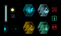
Sensors
Sample graphic components from the Sensors folder
The Sensors folder contains dynamic and static images representing sensors. Due to the features described in section 3, the graphic components in the folder must be arranged in the correct order in the PX file. This principle is the same as for the static images described in section 3.
Static Components
Static components do not have the suffixes described below. If added to a PX file, they are immediately connected to the graphic file.
Normal/Alarm Components
Components with the "normal-alarm" suffix are dedicated to bind Boolean variables indicating normal state or alarm/failure. Graphics representing normal and alarm statuses of the device have been added to these objects. The component has one control value (Value Binding), which causes switching between the graphics of the normal state (false) and the alarm (true) device.
Alarm Components
Components with the "alarm" suffix are dedicated to bind Boolean variables signaling an alarm or failure. Graphics representing the alarm status of the device have been added to these objects. The component has one control value (Value Binding), which impacts the Visibility property. The true value in the Boolean type component causes the graphics to be shown, while false causes the graphics to be hidden.
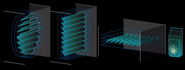
Humidifier
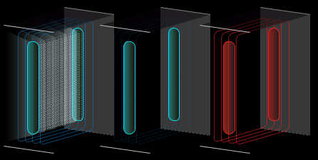
Sample graphic components from the Humidifier folder
The Humidifier folder contains dynamic images representing air humidifier. Due to the features described in section 3, the graphic components in the folder must be arranged in the correct order in the PX file. This principle is the same as for the static images described in section 3.
Alarm Components
Components with the "alarm" suffix are dedicated to bind Boolean variables signaling an alarm or failure. Graphics representing the alarm status of the device have been added to these objects. The component has one control value (Value Binding), which impacts the Visibility property. The true value in the Boolean type component causes the graphics to be shown, while false causes the graphics to be hidden.
On/Off Components
Components with the "off-on" suffix are dedicated to binding Boolean variables signaling operation or switching on. Graphics representing the status of switch-off and switch-on of a given device have been added to these objects. The component has two control values (Value Binding). The first one affects switching between switching off graphics (false) and operation (true) of the device. The second value impacts the Visibility property, where false causes the graphics to be shown, while true causes the graphics to be hidden (same variable as for the alarm component above).
Dragging a Boolean component from the Nav tree to a PX file, selecting "From Palette" in the Make Widget window, and then selecting "From Palette" from the palette of the object with the "off-on" suffix automatically pinpoints the dragged component to the control value described as switching between switch-off and switch-on graphics.
Fans
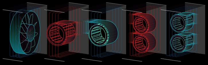
Sample graphic components from the Fans folder
The Fans folder contains dynamic images representing duct fans. Due to the features described in section 3, the graphic components in the folder must be arranged in the correct order in the PX file. This principle is the same as for the static images described in section 3.
Alarm Components
Components with the "alarm" suffix are dedicated to bind Boolean variables signaling an alarm or failure. Graphics representing the alarm status of the device have been added to these objects. The component has one control value (Value Binding), which impacts the Visibility property. The true value in the Boolean type component causes the graphics to be shown, while false causes the graphics to be hidden. Components with the "alarm-anim" suffix work in the same way as "alarm", the difference is that this component does not have a background in the form of a ventilation duct and must be placed above the layer with a fan and ventilation duct.
On/Off Components
Components with the "off-on" suffix are dedicated to binding Boolean variables signaling operation or switching on. Graphics representing the status of switch-off and switch-on of a given device have been added to these objects. The component has two control values (Value Binding). The first one affects switching between switching off graphic (false) and operation (true) of the device. The second value impacts the Visibility property, where false causes the graphics to be shown, while true causes the graphics to be hidden (same variable as for the alarm component above).
Components with the "off-on-anim" suffix work in the same way as "off-on", the difference is that "off-on" is not animated, while "off-on-anim" is animated in the on state, and the animated component, comparing the static component, does not have a background in the form of a ventilation duct and must be placed above the layer with a ventilation duct.
Dragging a Boolean component from the Nav tree to a PX file, selecting "From Palette" in the Make Widget window, and then selecting "From Palette" from the palette of the object with the "off-on" suffix automatically pinpoints the dragged component to the control value described as switching between switch-off graphics and switch-on animation.
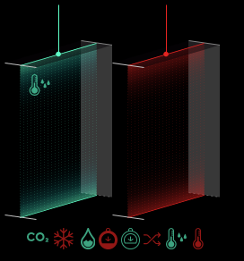
Heat Exchange
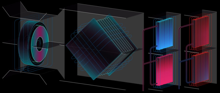
Sample graphic components from the Heat Exhange folder
The Heat Exchange folder contains dynamic images representing the heat exchangers of air handling units. Due to the features described in section 3, the graphic components in the folder must be arranged in the correct order in the PX file. This principle is the same as for the static images described in section 3.
Alarm Components
Components with the "alarm" suffix are dedicated to bind Boolean variables signaling an alarm or failure. Graphics representing the alarm status of the device have been added to these objects. The component has one control value (Value Binding), which impacts the Visibility property. The true value in the Boolean type component causes the graphics to be shown, while false causes the graphics to be hidden. Components with the "alarm-anim" suffix work in the same way as "alarm", the difference is that this component does not have a background in the form of a ventilation duct and must be placed above the layer with a fan and ventilation duct.
On/Off Components
Components with the "off-on" suffix are dedicated to binding Boolean variables signaling operation or switching on. Graphics representing the status of switch-off and switch-on of a given device have been added to these objects. The component has two control values (Value Binding). The first one affects switching between switching off graphics (false) and operation (true) of the device. The second value impacts the Visibility property, where false causes the graphics to be shown, while true causes the graphics to be hidden (same variable as for the alarm component above).
Components with the "off-on-anim" suffix work way as "off-on", the difference is that "off-on" is not animated, while "off-on-anim" is animated in the on state, and the animated component, comparing to the static component, does not have a background in the form of a ventilation duct and must be placed above the layer with a ventilation duct.
Dragging a Boolean component from the Nav tree to a PX file, selecting "From Palette" in the Make Widget window, and then selecting "From Palette" from the palette of the object with the "off-on" suffix automatically pinpoints the dragged component to the control value described as switching between switch-off and switch-on graphics.
Standalone HVAC
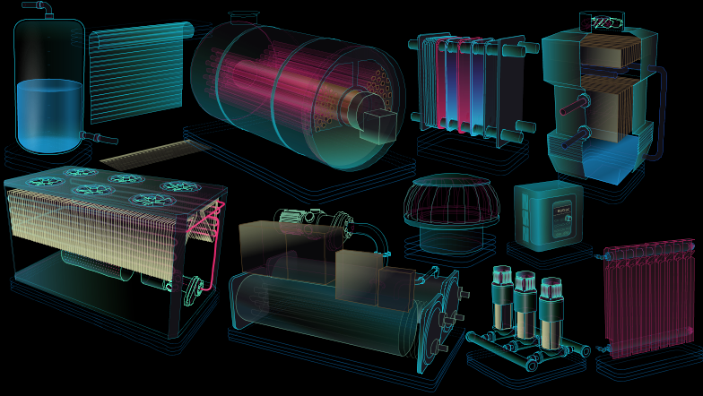
Sample graphic components from the Standalone HVAC folder
The HVAC Standalone folder contains dynamic images representing stand-alone devices. They include air handling units, blinds/rollers, boilers, chillers, compressors, control units, roof fans, heat exchangers, pumps, radiators, tanks, cooling towers.
Alarm Components
Components with the "alarm" suffix are dedicated to bind Boolean variables signaling an alarm or failure. Graphics representing the alarm status of the device have been added to these objects. The component has one control value (Value Binding), which impacts the Visibility property. The true value in the Boolean type component causes the graphics to be shown, while false causes the graphics to be hidden.
On/Off Components
Components with the "off-on" suffix in the name are dedicated to binding Boolean variables signaling operation or switching on. Graphics representing the status of switch-off and switch-on of a given device have been added to these objects. The component has two control values (Value Binding). The first one affects switching between switching off graphics (false) and operation (true) of the device. The second value impacts the Visibility property, where false causes the graphics to be shown, while true causes the graphics to be hidden (same variable as for the alarm component above).
Dragging a Boolean component from the Nav tree to a PX file, selecting "From Palette" in the Make Widget window, and then selecting "From Palette" from the palette of the object with the "off-on" suffix automatically pinpoints the dragged component to the control value described as switching between switch-off and switch-on graphics.
0-100% Components
Components with the "0-100" suffix are dedicated to binding numeric type variables containing analog control value in the range of 0-100%. Graphics have been added to these objects to represent the percentage drive of the device. The component has two control values (Value Binding). The first one affects switching between the graphics responsible for the level of adjustment depending on the entered value from 0 to 100. The second value impacts the Visibility property, where false causes the graphics to be shown, while true causes the graphics to be hidden (same variable as for the alarm component above).
Dragging a numeric component from the Nav tree to a PX file, selecting "From Palette" in the Make Widget window, and then selecting "From Palette" from the palette of the object with the suffix "0-100" automatically binds the dragged component to the control value described as switching between the graphics responsible for the adjustment level.
In case of tanks, the control value is the level of filling of the tank.
In case of blinds/roller blinds, the control value is the opening level (0 is a complete closure). The components "h-spin_0-100" and "v-spin_0-100" from 0 to 50% open the blinds, and from 51 to 100% raise them. The "outdoor_0-100" component causes lift over the whole range from 0 to 100%.
Grids
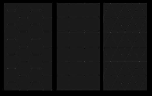
Sample graphic components from the Grids folder
The Grids folder contains static images representing grids. By adding these graphics to the PX file, triangular, square, and hexagonal grids can be constructed.
Floor Plan
Sample graphic components from the Floor plan folder
The Floor Plan folder contains dynamic images representing lighting, sensors, counters, and connectors placed on the floor plan.
Normal/Alarm Components
Components with the "normal-alarm" suffix are dedicated to bind Boolean variables indicating normal state or alarm/failure. Graphics representing normal and alarm status of the device have been added to these objects. The component has one control value (Value Binding), which causes switching between the graphics of the normal state (false) and the alarm (true) device.
Alarm Components
Components with the "alarm" suffix are dedicated to bind Boolean variables signaling an alarm or failure. Graphics representing the alarm status of the device have been added to these objects. The component has one control value (Value Binding), which impacts the Visibility property. The true value in the Boolean type component causes the graphics to be shown, while false causes the graphics to be hidden.
On/Off components
Components with the "off-on" suffix are dedicated to binding Boolean variables signaling operation or switching on. Graphics representing the status of switch-off and switch-on of a given device have been added to these objects. The component has two control values (Value Binding). The first one affects switching between switching off graphics (false) and operation (true) of the device. The second value impacts the Visibility property, where false causes the graphics to be shown, while true causes the graphics to be hidden (same variable as for the alarm component above).
Dragging a Boolean component from the Nav tree to a PX file, selecting "From Palette" in the Make Widget window, and then selecting "From Palette" from the palette of the object with the "off-on" suffix automatically pinpoints the dragged component to the control value described as switching between switch-off and switch-on graphics.
Piping

Sample graphic components from the Piping folder
The Piping folder contains dynamic and static images representing the pump, flow meters, meters, pipes, and valves (manual, electrical, and pneumatic).
Static Components
Static components are placed in subfolders "pipes_cold", "pipes_hot", and "pipes_mix". If added to a PX file, they are immediately connected to the graphic file.
Normal/Alarm Components
Components with the "normal-alarm" suffix are dedicated to bind Boolean variables indicating normal state or alarm/failure. Graphics representing normal and alarm status of the device have been added to these objects. The component has one control value (Value Binding), which causes switching between the graphics of the normal state (false) and the alarm (true) device.
Alarm Components
Components with the "alarm" suffix are dedicated to bind Boolean variables signaling an alarm or failure. Graphics representing the alarm status of the device have been added to these objects. The component has one control value (Value Binding), which impacts the Visibility property. The true value in the Boolean type component causes the graphics to be shown, while false causes the graphics to be hidden.
On/Off Components
Components with the "off-on" suffix are dedicated to binding Boolean variables signaling operation or switching on. Graphics representing the status of switch-off and switch-on of a given device have been added to these objects. The component has two control values (Value Binding). The first one affects switching between switching off graphics (false for horizontal, true for vertical) and operation (true for horizontal, false for vertical) of the device. The second value impacts the Visibility property, where false causes the graphics to be shown, while true causes the graphics to be hidden (same variable as for the alarm component above).
Components with the "off-on-anim" suffix work in the same way as "off-on", the only difference is that "off-on" is not animated, while "off-on-anim" is animated in the on state.
Dragging a Boolean component from the Nav tree to a PX file, selecting "From Palette" in the Make Widget window, and then selecting "From Palette" from the palette of the object with the "off-on" suffix automatically pinpoints the dragged component to the control value described as switching between switch-off and switch-on graphics.
Multicondition
Components with "0-2" or "0-4" suffixes are dedicated to binding numeric type variables containing an integer. Graphics have been added to these objects to represent the appropriate device condition depending on the input. The component has two control values (Value Binding). The first one affects the switching between the graphics responsible for the condition depending on the entered value (0, 1, 2, 3, 4). Entering a value outside the range of the device displays the same status as entering 0. The (0-4) value of the variable presents the flow direction of the medium in the graphics, not the valve opening level (components dedicated for coil installations). The (0-2) value of the variable presents similar as above in the graphics (components dedicated for pipe installations). The second value impacts the Visibility property, where false causes the graphics to be shown, while true causes the graphics to be hidden.
Dragging a numeric component from the Nav tree to a PX file, selecting "From Palette" in the Make Widget, and then selecting "From Palette" from the palette an object with the "0-2" or "0-4" suffix automatically binds the dragged component to the control value described as switching between graphics responsible for the device condition.