The article outlines how to configure a graphic widget in the Niagara driven system (with the Px Editor) in order to make it dynamic and show a value of any component. The article focuses chiefly on general presentation of animating graphic widgets, with most frequently encountered examples; it does not cover all "binding" extensions available in the Niagara system (however, it does cover the most frequently used one, Value Binding from the bajaui module) and graphic widgets.
Before the start, it is required to add components containing specified values (the default values are null; it is required to enter other values in these components, for example, using the Set action). In the example provided in this article, the following components have been added:
|
No. |
Name |
Type |
Value |
Facets |
|---|---|---|---|---|
|
1 |
MainLight |
BooleanWritable |
"true" |
trueText=On;falseText=Off |
|
2 |
RoomTemperature |
NumericWritable |
"21.0" |
units=°C |
|
3 |
Address |
StringWritable |
"1 Sierpnia Street 6, 02-134 Warsaw" |
|
Table 1. Configuration of components in the example
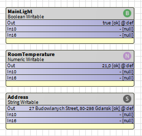
Figure 1. Components in the example, the Wire Sheet view
Next, create a PX view in any location, and edit it using the Px Editor.
The primary thing now is to add a few different graphic widgets in the workspace; in this example, these are Picture and Label from the bajaui palette, and IsmaPicture from the iSMA_Graphics palette:
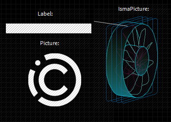
Figure 2. Graphic widgets added to the PX view in the exmaple
In the provided example, the Picture and IsmaPicture widgets may be treated as having the same functionality.
In order to transform a static widget in to a dynamic one, it has to have the "binding" extensions added. Mark the widget, and in the Properties window click the plus icon (Add binding); the pop-up window shows with a list of binding extensions supported by the widget. As mentioned above, the article focuses only on the most popular, Value Binding extension from the bajaui module.

Figure 3. Adding the binding extension to the graphic widget in the PX view
The following sections outline different effects acquired with the use of the Value Binding extension - each graphic widget has been added such extension.
1. Text Animation
The text animation in the graphic widget containing a "text" slot can be carried out in several ways, which are covered in the below sections. The main common property is to connect the binding extension to slot animation - to do this, right-click the 'text' slot and select the Animate option from the context menu. Then, the pop-up window appears, which allows to configure the animation to the expected outcome.
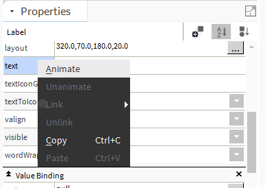
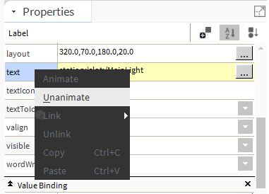
The animation can be removed the same way - right-click the slot highlighted in yellow, and select the Unanimate option from the context menu.
1.1. Displaying Component's Value
To display the component's value in the widget, first, insert the component's path in the 'ord' slot of the Value Binding extension. This example shows the Label widget and the RoomTemperature component. Next, the animation in the 'text' slot has been created, as in the figure below.
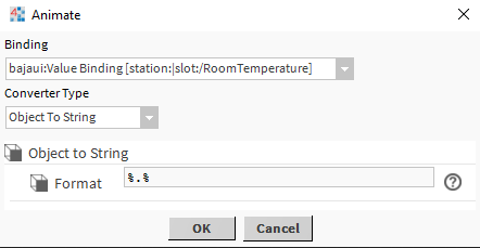
With this configuration, the text displayed in the Label widget includes the value, unit, status, and priority: 
Figure 7. The text displayed with the default configuration of the Object To String - the RoomTemperature component's value in the Label widget
In order to display only the value with units, it is necessary to change the animation configuration in the Format slot - insert %out.value% instead of the default %.%: 
Figure 8. Changed configuration of the Object To String animation - displaying the RoomTemperature component's value in the Label widget
With this configuration, the text in the Label widget includes only the value and unit, which is much more clear for the BMS system user.

Figure 9. Text displayed with the Object To String changed configuration - the RoomTemperature component's value in the Label widget
In the same way the StringWritable component's text (Address) displaying can be set, for example:

Figure 10. Text displayed with the Object To String changed configuration - the Address component's value in the Label widget
Also, the BooleanWritable (MainLight) component's value can be displayed in the same manner; in such case, the text set in the Facets slots is displayed:

1.2. Switching Between Static Texts
This functionality allows to set two static texts, which are displayed depending on the component's value. In the ord slot of the Value Binding extension, in the Label widget, the path to the MainLight component has been inserted. Next, the animation on the 'text' slot has been set, as in the figure below:
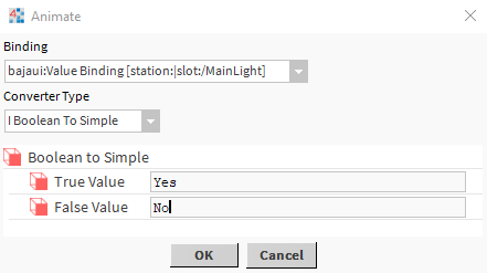
With this configuration, depending on the MainLight component's value (true or false), and regardless of the set Facets, the Label widget will display static texts, Yes or No.
The similar effect may be achieved for the NumericWritable value (the RoomTemperature component). First, remove the previous animation; next, change the 'ord' path in the Value Binding extension to the RoomTemperature component. In the end, animate the 'text' slot, as in the figure below:
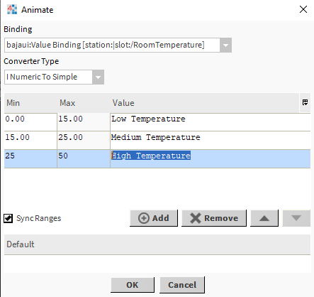
The 'I Numeric To Simple' conversion allows to set ranges of values to display a certain text. Ranges can be added or removed with the Add and Remove buttons. The Sync Ranges checkbox automatically synchronizes the ranges - if the first range has the maximum value of 15, the next will start from 15.
2. Animation of Displayed Graphic
This section outlines how to change the graphic contents of the Picture widget along with the component's value change. First, add the Value Binding extension, and in the 'ord' slot insert the MainLight (BooleanWritable) component path. Then, create the animation in the 'image' slot and configure it as in the figure below:

With this configuration, the Picture widget switches the displayed graphic files with the MainLight component's value change. The same can be set for the NumericWritable components, only the conversion type has to be set to the 'I Numeric To Simple' - the configuration and functionality is adequate to the contents of the 1.2 section.
In order to use ready-to-go, advanced graphic components it is recommended to use the iSMA_Graphics module palette. It offers ready-to-go widgets' configurations, containing a wide range of graphic files ready to be used in the HVAC devices visualizations.
3. Widget Visibility Control
This section outlines how to hide and show a graphic widget (Picture, in this case) with the component's value change. First, add the Value Binding extension, and in the 'ord' slot insert the MainLight (BooleanWritable) component path. Then, create the animation in the 'visible' slot and configure it as in the figure below:
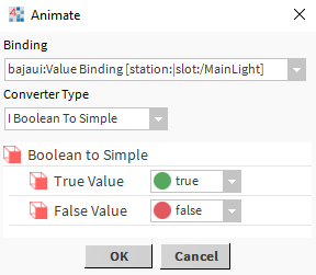
In the given example, the Picture widget is visible if the MainLight component's value is true, and hidden if it is false. Naturally, this logic may be reversed with adequate configuration of the 'I Boolean To Simple' property.
